💡The " Notion Life Community " is now open!
By subscribing, you can read all paid articles , and you also get benefits such as Notion support for questions and study sessions . Click here to join the community where you can connect with many Notion users!
I've been thinking for a long time that it would be nice to have a graph feature in Notion. I'm sure there are many people who have been waiting for the same thing.
This graph function has finally appeared as an official feature, "Notion Charts"!
In this article, we'll be introducing the new Notion Chart feature. We'll explain in detail the types of charts you can create, how to create them, and even the finer details like changing colors!
🎬 Director: Rei
✍🏻 Writer: Mino Kurumi
1.What is a Notion chart?
The newly introduced graph feature, "Notion Charts," is a new feature that allows you to graph databases in Notion.
Until now, graphs could only be created using external services such as ChartBase, which we previously introduced, but they have now finally been added to Notion's official features!
ChartBase's explanatory articles are still popular, so this new chart feature is sure to be a welcome addition for Notion users.
🔗Click here for the article on "ChartBase" that we introduced previously.
From here, we will introduce in detail the types of graphs that can be created, how to create graphs, and detailed settings!
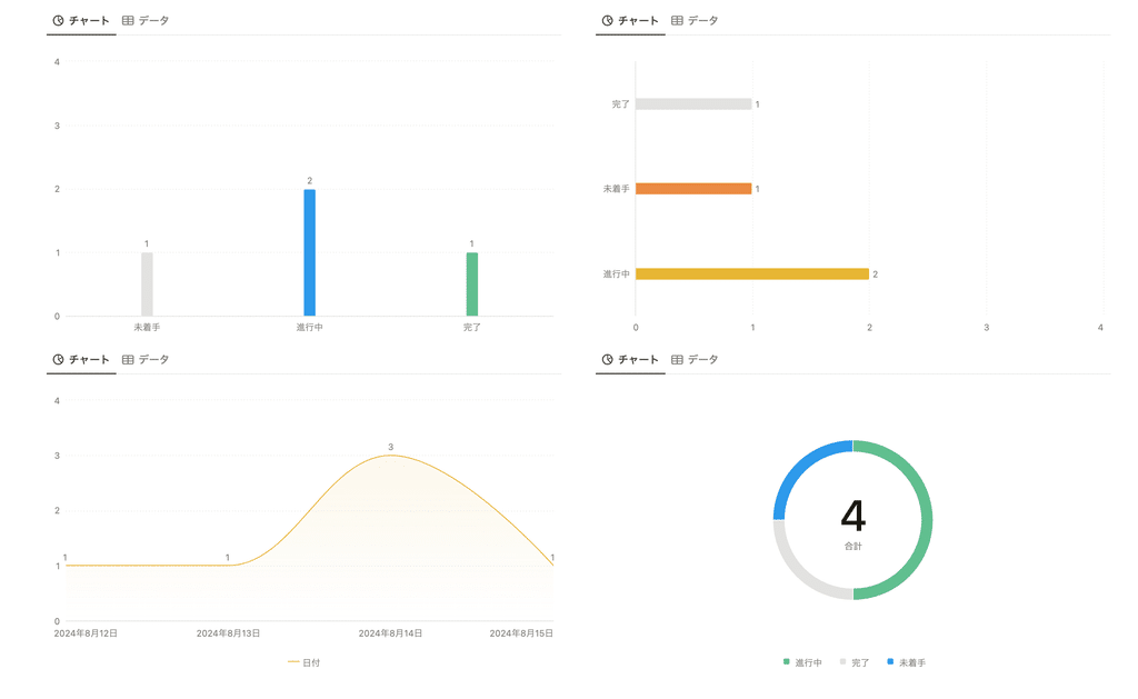
2. Types of graphs and their use cases
There are four types of graphs that can be created: vertical bar graph, horizontal bar graph, line graph, and donut graph.
This time, I actually created each graph based on this household budget template!
2-1. Column chart
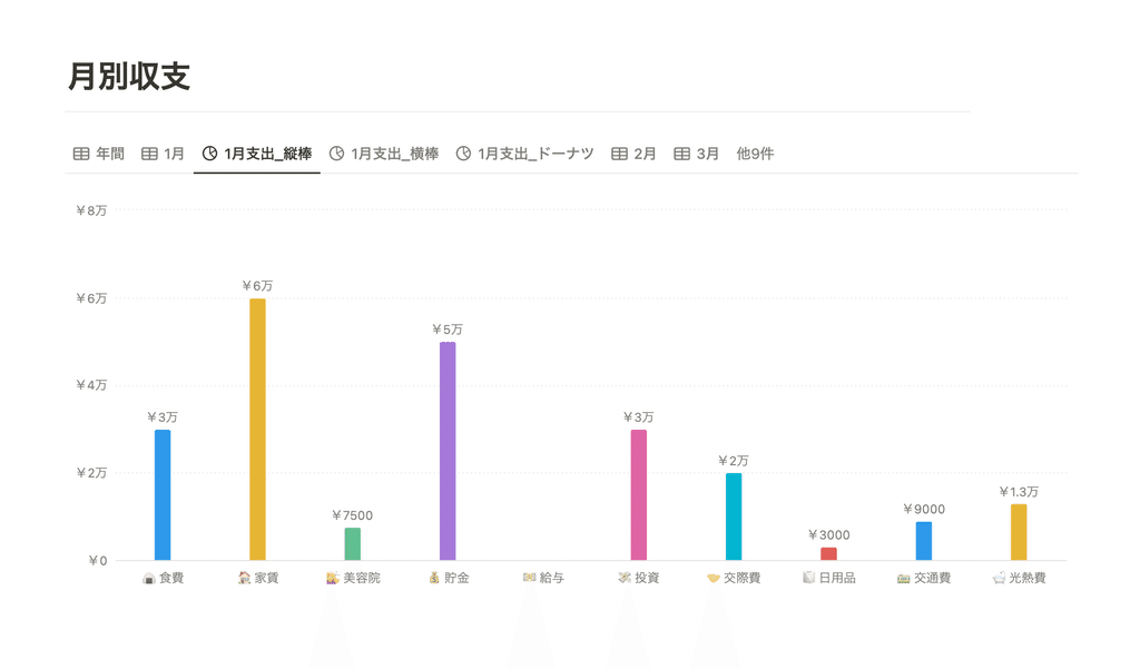
A simple column chart is useful for identifying high and low values.
As an example, I've created a graph of monthly expenses broken down by category, such as "rent" and "food." At a glance, it's very easy to see where you're spending your money.
2-2.Bar graph
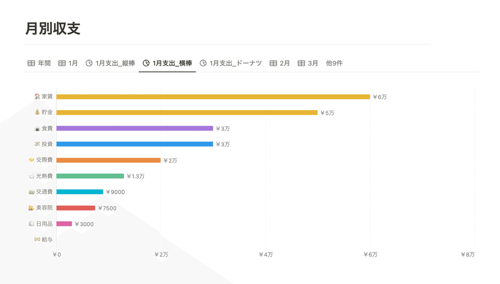
Next, we'll show the same information in a bar graph. Bar graphs are useful for comparing values by sorting them in ascending or descending order.
2-3. Line graph
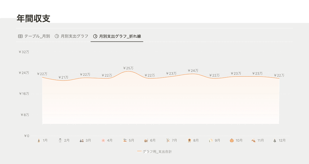
Line graphs are useful for seeing changes in values over time. Here, I created a line graph of total annual expenses.
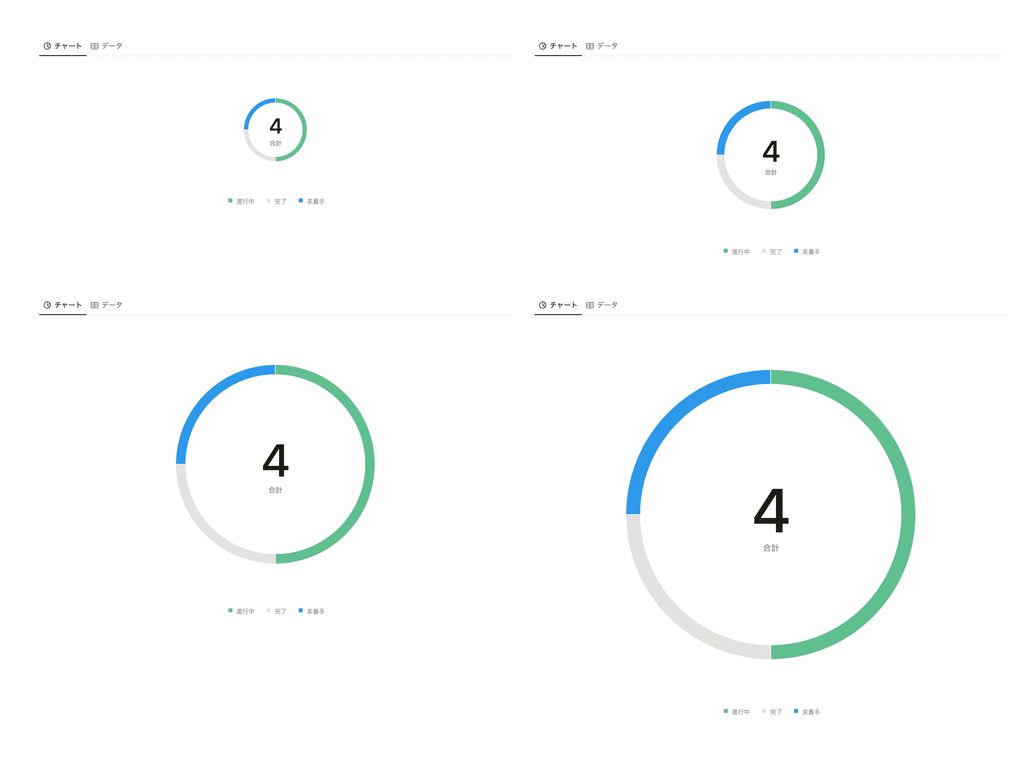
2-4. Doughnut chart
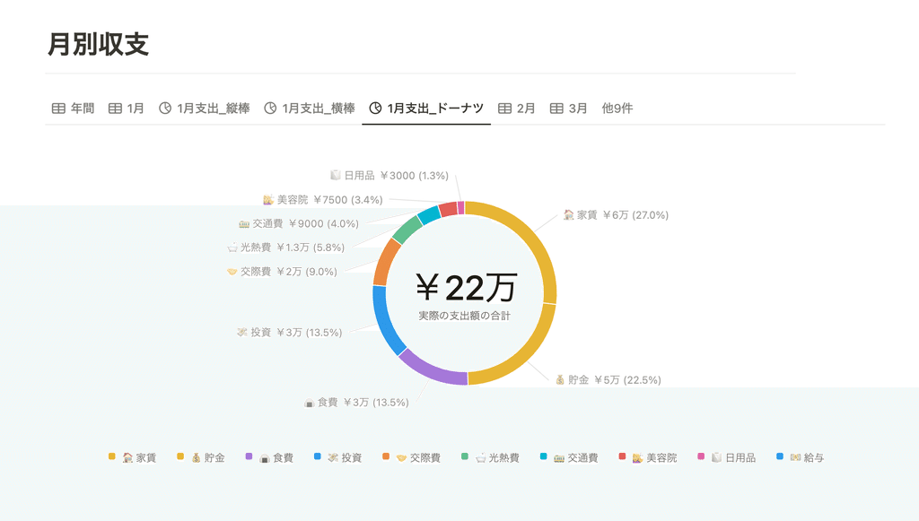
Donut charts are useful for comparing breakdowns and percentages of the whole. They make it easy to see how much of the whole each item contributes to.
3. How to create a graph and the items that can be set
Next, we will introduce how to create graphs and the settings you can make, such as changing colors and whether or not to display labels.
3-1. How to create a graph
This time, "Notion Chart" has been added as one of the views, so you can create graphs on the screen where you change views.
1. Select "Chart" from the "..." icon in the upper right corner of the database you want to graph.

2. Select your preferred graph (chart) type

You can also create a graph from scratch by selecting "Graph" from the "+" icon. In this case, you can select an existing database or create a new database to create a graph.

🔗Click here to learn more about "Views"!
3-2. Items that can be set
From here, we will introduce in detail the items that can be configured in detail.
X-axis and Y-axis settings
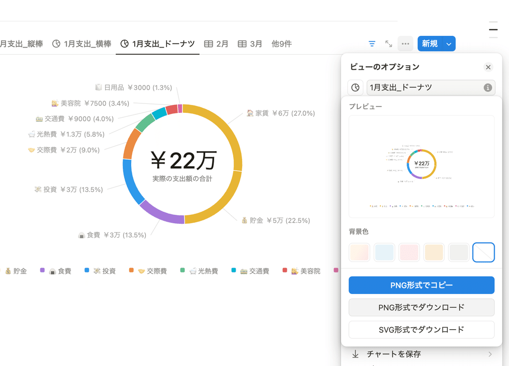
For column, bar, and line graphs, you can set database properties for the X and Y axes. Open the options by clicking "..." in the upper right corner of the graph, and set the appropriate settings in the "Data" section.

Sorting and excluding zero values
You can sort each item in the graph alphabetically, by the largest number, etc. You can also simplify the appearance by turning on "Exclude zero values."

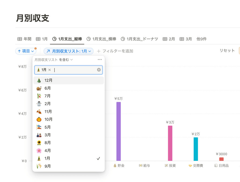
Apply a filter
Since "Notion Chart" is a database view, you can also apply filters to it, which is useful when you want to narrow down your annual data to just this month, for example.
Change color
The color of all graphs can be changed. You can choose your favorite color from a total of 10 colors, including colorful, gray, blue, yellow, green, etc.
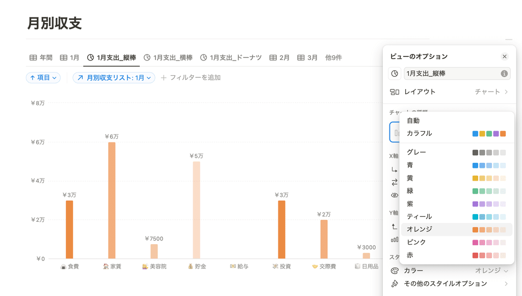
Colors other than Colorful are displayed as a gradient based on that color. Also, if you select "Select" or "Status" for the X-axis or Y-axis data, the color of each tag will be reflected.
You can choose the height (size) of the graph and whether or not to include labels.
From "More Style Options," you can choose the height of the graph from large, medium, small, or extra large. You can use it to suit your page, such as small for a compact display or extra large for a full-screen display.
Also, from the "More Style Options" menu, you can choose whether to show or hide the graph grid lines, axis labels, and data labels. The settings are almost the same as those for Excel and PowerPoint graphs, so it seems easy to use.

You can save the graph as an image.
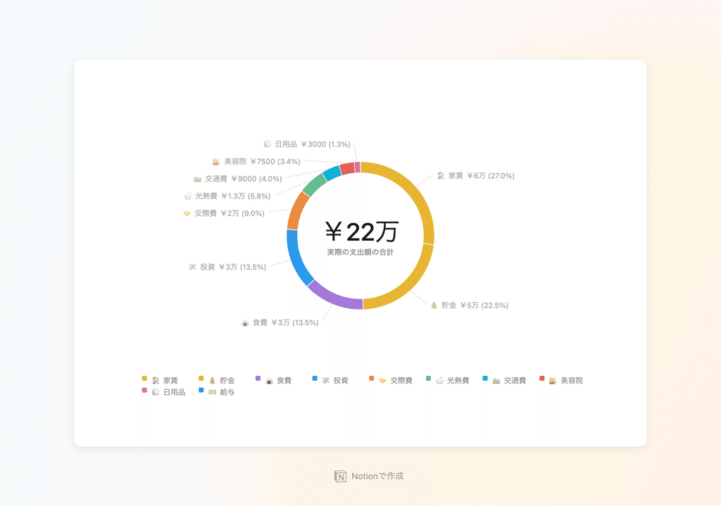
Even more convenient is the ability to copy and save graphs. By selecting "Save Chart" in the menu, you can copy or save just the graph as an image.
You can also choose the background color, and when you save it with a gradient background color, it looks like this. This means you can attach it to PowerPoint and other apps, so it can be used in a variety of ways.
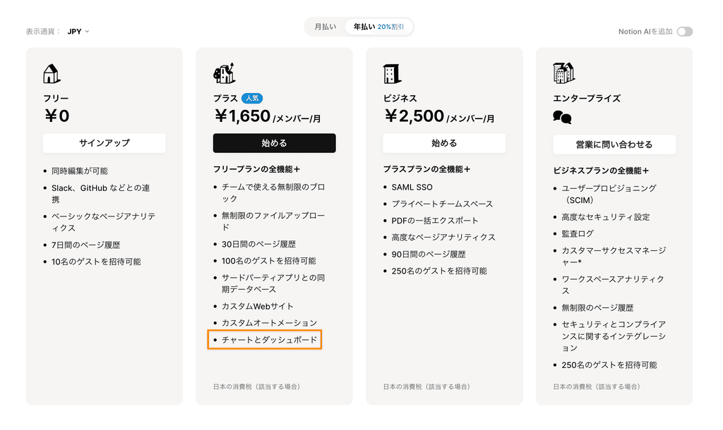
Free plan only allows one graph, paid plan allows unlimited graphs
As for the restrictions on each pricing plan, as of August 2024, there is only one free plan, and paid plans (Plus plan and above) can be used unlimitedly.
With the free plan, you'll likely need to use it in a creative way, such as limiting it to the graphs you need most or taking advantage of the image saving feature.
summary
This concludes our explanation of Notion's long-awaited new feature, "Notion Charts"!
One of the features we've been waiting for has finally arrived! It's a bit disappointing that there are some limitations depending on the plan, but we hope you'll take this opportunity to try it out!
Click here for a list of Notion templates available on "Notion in Life" !

The book "Notion Life Hacks" is now on sale! It includes 36 templates and provides plenty of practical tips on how to use Notion.

We also introduce how to use Notion and specific examples of its use on YouTube , so please take a look if you're interested.

We will continue to provide information about daily life and Notion to help you get the most out of your busy days.
Thank you for reading to the end!
See you in the next article.


![[Study Group Report] We held a Notion Formula Study Group!](http://kurashi-notion.com/cdn/shop/articles/2510_notionblog_formulaseminar_967275ed-a27f-4af8-ab02-34ca3ee3f96a.jpg?v=1762425140&width=1920)